by PushtoLearn
Adaptive design for smartphones and tablets
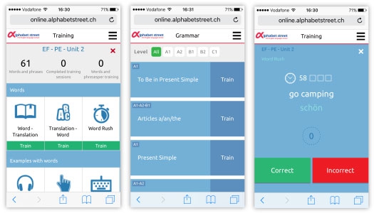
The platform for language schools determines the sreen size of the user and shows the adapted interface. It means that now students can train and learn on all their devices. Adaptive design enabled us to preserve major features of the service across all platforms and devices (iOS, Android, Windows Phone etc).

We redesigned all parts of the PushtoLearn platform: training, grammar, tests, media, vocabulary and dashboard were rebranded in flat design concept. The main goal of the new design was to prepare the platform for the introduction of adaptive design. All elements of the interface must be flexible and adjustable to fit any screen size – smartphones and tablet PCs. It is obvious that many users choose smartphones and tablets to work on the platform, so it should be fully functional for them. We have chosen the concept of a web-application instead of a mobile application to avoid compatibility and support issues with iOS and Android. Web-application detects the screen size of the device and adapts its design to the resolution of the screen without losing features and performance.

